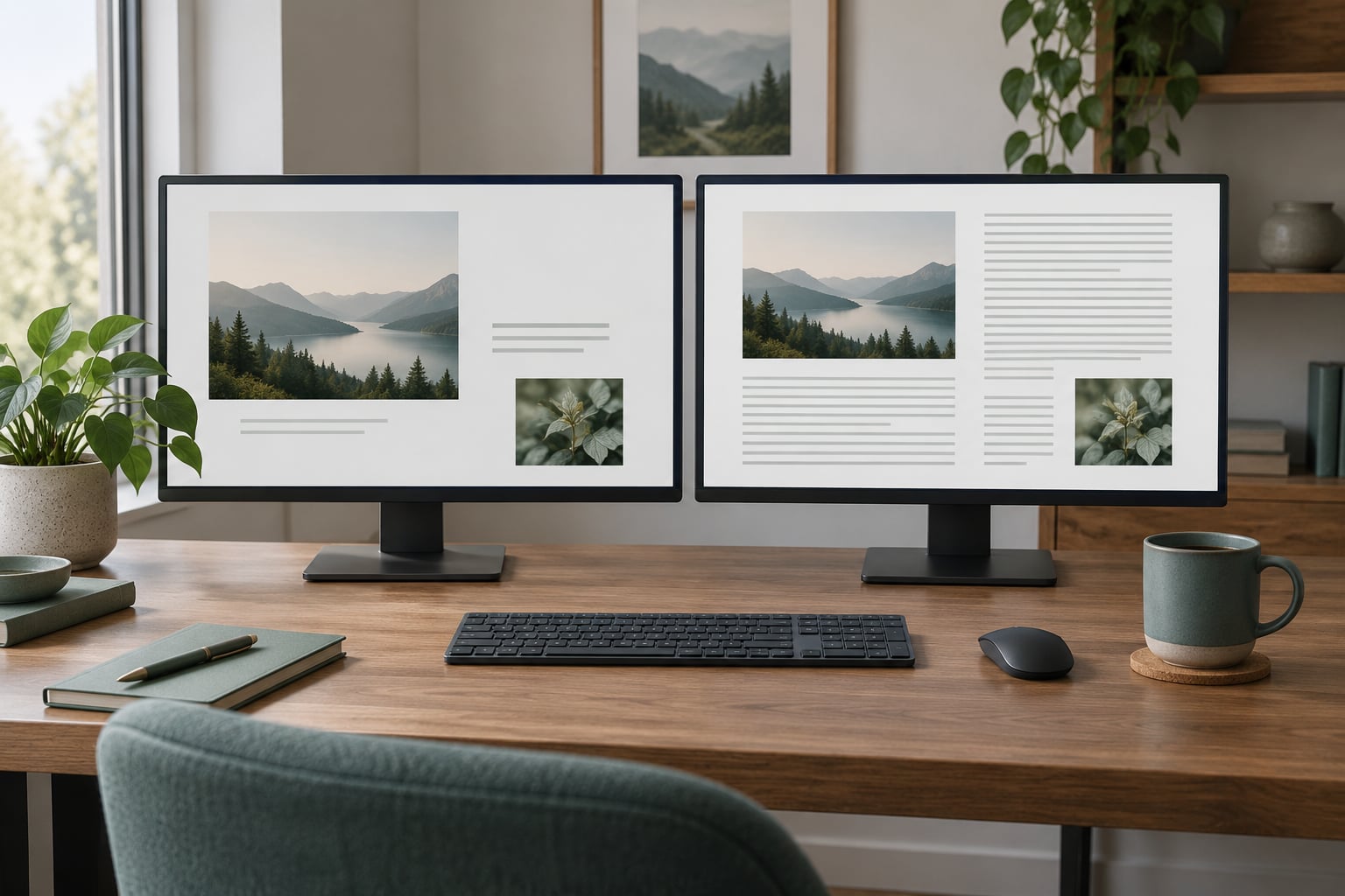
For everyday desk work, a 27-inch 1440p monitor is the safer buy for most people, and a 27-inch 4K monitor is the better buy when your day is documents, code, spreadsheets and two windows side by side. If you are weighing a 1440p vs 4K monitor for everyday use, resolution on its own decides very little. Screen size, how far back you sit and whether your computer can push the pixels matter more.
That framing matters in 2026 because 4K panels are no longer exotic at 27 inches, and the old argument that 4K costs more no longer settles it by itself. What still decides the purchase is pixel density measured against your viewing distance.
A few definitions first, because the two resolutions are described in a lot of different ways. 1440p is 2560×1440 pixels, and it is also sold as Quad HD, QHD or sometimes loosely as 2K. 4K UHD is 3840×2160. Same 16:9 shape, same aspect ratio, just a lot more pixels: 4K UHD has about 2.25 times as many as 1440p, which is where the extra cost, the extra GPU load and the extra sharpness all come from.
Table of Contents
- 1440p vs 4K Monitor for Everyday Use at a Glance
- How Different Does 1440p Look from 4K?
- Is a 1440p vs 4K Monitor Better for Text?
- What pixel density means when you read
- 1440p vs 4k monitor for everyday use and the scaling trap
- Why 1440p looks blurry on a 4K monitor
- Which Resolution Is Better for Video and Games?
- What About Eye Comfort, Power Use and Desk Space?
- Viewing distance and desk space
- Power use in real terms
- Matte, glossy and OLED
- Which Option Offers Better Value?
- Which Should You Choose?
- Frequently Asked Questions
- Is a 4K monitor worth it at 27 inches?
- Does 4K use more electricity than 1440p?
- Is 1440p easier on the eyes than 4K?
- Do I need a powerful graphics card to use a 4K monitor?
- Is 1440p better for a 32-inch monitor?
- Can I use a 4K monitor with a laptop or office computer?
- Conclusion
1440p vs 4K Monitor for Everyday Use at a Glance
| Factor | 1440p (2560×1440) | 4K UHD (3840×2160) |
|---|---|---|
| Total pixels | 3.7 million | 8.3 million |
| Pixel density at 27 inches | About 109 PPI | About 163 PPI |
| Sweet spot size | 24 to 27 inches | 27 to 32 inches |
| Text clarity at normal desk distance | Good, comfortable sizes | Very sharp once scaling is set correctly |
| Usable workspace at 27 inches | About 2560×1440 of desktop | 2560×1440 of desktop at 150 percent scaling |
| Graphics load | About half of 4K for the same scene | About 2.25x of 1440p |
| Typical refresh rate at the same budget | 144Hz to 165Hz | 60Hz to 120Hz |
| Scaling setup | Run at 100 percent | Needs 150 percent in Windows, HiDPI on macOS |
| Power draw | Lower, especially at 24 inches | Higher, more pixels lit and usually a bigger backlight |
| Price tier | Lower | Higher, though the gap has narrowed a lot |
| Best for | Mixed work and play, tight desks, fast games | Dense text, side-by-side windows, coding, editing |
One line to remember: at 27 inches, 4K gives you roughly 50 percent more pixels per inch than 1440p, and that gap is what your eyes actually notice.
How Different Does 1440p Look from 4K?
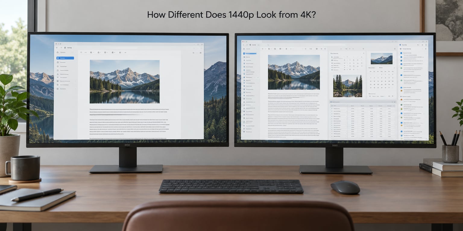
The difference is real, but it is not the night-and-day jump the marketing implies. What your eye reads as sharpness comes from pixel density, measured in pixels per inch, and density only counts in combination with how far away you sit.
Here is the math for the sizes people actually buy.
| Screen | Resolution | Approximate PPI |
|---|---|---|
| 24 inch | 1920×1080 | 92 |
| 27 inch | 1920×1080 | 82 |
| 24 inch | 2560×1440 | 123 |
| 27 inch | 2560×1440 | 109 |
| 32 inch | 2560×1440 | 92 |
| 27 inch | 3840×2160 | 163 |
| 32 inch | 3840×2160 | 138 |
Read that table twice, because two entries surprise people. A 27-inch 4K monitor at 163 PPI is the sharpest everyday panel on this list, yet a 32-inch 4K monitor at 138 PPI is less sharp than a 24-inch 1440p at 123 PPI. Same badge, softer text.
At a typical seated distance of 60 to 80 cm, the jump from 109 PPI to 163 PPI is a consistent, easy-to-see improvement on body text, icons and spreadsheet numbers. It is not a transformation. You will notice it most in places where fine detail matters: punctuation in a paragraph, hairlines in a photo, small text in a code editor.
The other size cases land differently. At 24 inches, 1440p is already dense enough that 4K’s extra pixels feel wasted on a desk that close. At 32 inches you sit further back, which softens the 1440p panel’s edges, and the 4K panel earns part of its extra cost. At a 34-inch ultrawide, 1440p is the normal choice anyway.
Is a 1440p vs 4K Monitor Better for Text?
4K is better for text, once scaling is configured. Out of the box at 100 percent, a 4K monitor makes everything look small, and that is the single biggest reason people who expected a sharper screen end up disappointed.
What pixel density means when you read
Text sharpness comes down to how tightly pixels are packed. At 109 PPI on a 27-inch 1440p panel, a 12-point font still has enough pixels to render clean strokes without looking coarse. At 163 PPI on a 27-inch 4K panel, the same font at the same physical size has visibly smoother edges, and small punctuation marks stop merging into a grey smudge.
For long sessions of PDFs, specs, email and browser text, that difference is the thing you feel at the end of the day. One r/buildapc user put it plainly: 4K makes a huge difference for office work, everything is clearer and easier to read. That sentiment is common among people whose work is mostly on screen and who sit close to it.
1440p vs 4k monitor for everyday use and the scaling trap
Here is the part most guides skip. Scaling is what decides whether 4K feels like an upgrade or a downgrade, and there are three steps worth getting right.
- On Windows 11, open Settings, then System, then Display, then Scale and layout. A 27-inch 4K panel at 100 percent is uncomfortable. The recommended setting is usually 150 percent, which gives you a 2560×1440 workspace with 1.5 times the detail.
- On Windows 10, use Settings, System, Display, and the Scale slider under Display scaling. Pick 150 percent for a 27-inch 4K screen, or 125 to 150 percent for a 32-inch one.
- On macOS, open the Apple menu, then System Settings, then Displays. With a 4K screen connected, macOS adds a row of scaled options under the monitor thumbnail. Choosing the 2560×1440 row is what gives you the sharp-but-workable mode.
Leave it at 100 percent and you will squint. That is fixable in five minutes, and any decent 4K monitor review mentions it in the first paragraph for exactly that reason.
Why 1440p looks blurry on a 4K monitor
You will also see people claim that a 4K monitor works as a 1440p monitor for free, just run it at 1440p. Partly true, and partly the source of a lot of confusion. At 1440p on a 4K panel, each screen pixel becomes a 1.5 by 1.5 block, and that fractional scaling has to be reconstructed by the driver. The result is not the same as a native 1440p panel.
As one r/Monitors user put it, 1440p on 4K looks actually much worse than native 1440p. The size of the text and windows matches, so you get the workspace you expected, but the rendering is softer. Native 1440p on a 1440p panel stays crisp because every pixel is lit directly.
So a 4K monitor is not automatically a superset purchase. If you plan to run it at 1440p most of the time, you are paying for pixels you have switched off.
Which Resolution Is Better for Video and Games?
4K wins for video and for anything where you notice detail, and it loses on frame rate unless your graphics card can afford the extra 2.25 times the pixels. Video is straightforward: 4K content renders natively, and a 1440p screen either shows it downscaled or letterboxed by the streaming app.
Gaming splits by genre. Fast shooters and competitive titles live or die on frame rate and input lag, and 1440p panels reach 144Hz or 165Hz at the same money where 4K panels sit at 120Hz. That difference is felt more than the extra sharpness. Players of slower single-player games, strategy titles and anything with dense environments get more from 4K detail than from another 30 frames per second.
The 2.25 times pixel gap is the whole argument, and it is not evenly distributed. In a demanding game at 4K you may drop graphics settings or enable upscaling from DLSS, FSR or XeSS to hold a playable frame rate. Renderers like upscaling are good, but a native 4K image still looks cleaner than a reconstructed one at the same output resolution.
One more thing for console players: a modern console can output 4K well beyond 60Hz, so HDMI 2.1 matters more there than resolution does. Check the port before you buy, not after.
What About Eye Comfort, Power Use and Desk Space?
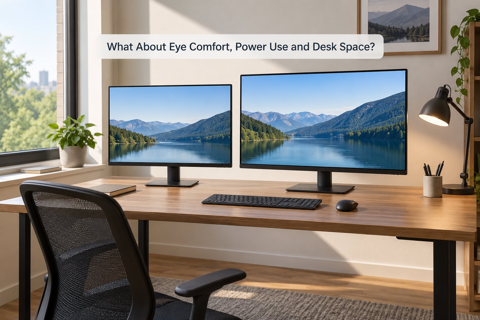
Eye comfort depends far less on resolution than people expect. It comes from panel size matched to viewing distance, brightness set to match the room, a matte coating if you sit near a window, and a flicker-free backlight. All of those exist in both resolutions at similar prices.
Where resolution sneaks in is through text size. Small, cramped text makes eyes work harder regardless of how crisp it is, and that is the real reason a badly configured 4K screen can feel worse than a 1440p one.
Viewing distance and desk space
A 27-inch screen sits about 60 to 70 cm from your eyes, which is comfortable for a full day of general work. A 32-inch panel wants 70 to 80 cm and a deeper desk. Push a 32-inch screen too close and you start moving your head between corners, which nobody enjoys by hour six.
Desk depth is the constraint people forget. A 32-inch 4K monitor has a wider bezel-to-bezel area even though the pixel count is high, so it needs more physical space, and if your desk is a metre deep with a laptop on it, you will end up leaning in.
Power use in real terms
4K monitors do usually draw more power, mostly because a bigger panel needs a bigger backlight and more pixels are lit. The gap on a desk setup is small in absolute terms, more a short lamp’s worth than a meaningful household charge, and it shrinks further if you run a brightness or eco mode. Power should be near the bottom of your list, not a reason to pick one resolution.
Matte, glossy and OLED
A matte coating handles reflections better and is the safer everyday choice in a bright room. Glossy panels look stunning with dark content but turn into a mirror with a window behind you. If you are considering OLED for text-heavy work, read the subpixel rendering situation first: without an image scaling mode, text on a 1440p OLED looks softer than on an LCD of the same resolution, and burn-in from a static white document left open all day is a real consideration for office desks.
Which Option Offers Better Value?
Value depends less on resolution than on the rest of the spec sheet, which is where the money actually goes. At the same budget, a 1440p panel often funds a higher refresh rate, adaptive sync and a better stand, while a 4K panel funds pixel density and, increasingly, USB-C docking.
- Panel type: IPS is the everyday default at both resolutions, with accurate colours and good viewing angles. VA gives deeper blacks for media, TN is cheap but has poor angles and colour. OLED wins on contrast and motion, at the cost of text handling and burn-in risk on a desk.
- Refresh rate and adaptive sync: 1440p pairs naturally with 144Hz and 165Hz. At 4K, 120Hz is the current sweet spot. FreeSync and G-Sync Compatible work at both resolutions, though the VRR range matters more than the badge.
- Ports: DisplayPort is the right choice for a desktop PC. USB-C with power delivery turns a single-cable laptop setup into a one-plug affair. HDMI 2.1 only matters if a console is in the mix.
- Colour and HDR: For document work, accuracy at low brightness beats peak brightness. HDR400 badges are common and largely marketing; true HDR needs real peak brightness and local dimming.
- Stand and mounting: Height adjustment, tilt and VESA compatibility matter more for comfort over a working day than any of the above. A fixed stand on a 32-inch screen is a common regret.
The other half of value is the total picture. A 4K monitor on a system that cannot feed it costs you money twice, once for the panel and again for the graphics card you end up buying. If you already have a capable GPU, that second cost disappears and 4K looks like much better value.
Which Should You Choose?
Choose 1440p if you want a straightforward everyday screen, play fast games, sit close to a 24 or 27-inch panel, or want to spend as little as possible on the monitor. Choose 4K if you read all day, work in code or spreadsheets, or like two windows side by side and refuse to give either one up.
By size, the rules are straightforward. At 24 inches, 1440p and stop there. At 27 inches, it depends on your workload, and that is the size where this decision is actually made. At 32 inches, 4K is the right call because 1440p at that size feels soft. At 34 inches or wider ultrawide, you are looking at 3440×1440 and the question mostly answers itself.
Two practical checks before you buy. First, work out your viewing distance, because a 27-inch screen at 80 cm and a 32-inch screen at 80 cm are not the same experience. Second, confirm your graphics output. If you drive a laptop with integrated graphics, a single 4K monitor is perfectly manageable for office work and video, but gaming on it will be capped.
If you like games and mostly do documents, the middle path is real: a 27-inch 4K panel at 120Hz gives you both sharpness and smooth motion, provided your system can push it.
Frequently Asked Questions
Is a 4K monitor worth it at 27 inches?
Worth it if your day is text, code, spreadsheets or side-by-side windows, because 163 PPI makes small type noticeably cleaner at normal desk distance. Less convincing if you mostly browse, watch video and play fast games, where 1440p at 165Hz feels smoother for similar money. This is the size where the choice genuinely matters.
Does 4K use more electricity than 1440p?
Usually a little more, because a larger panel needs a bigger backlight and more pixels are lit. On a desk setup the difference is small in absolute terms, roughly the draw of a lamp, and it shrinks further with brightness or eco modes set lower. Power use is rarely a good reason to choose 1440p over 4K.
Is 1440p easier on the eyes than 4K?
Not inherently. Both panels can be flicker-free and matte. What tires eyes is tiny or cramped text, and an unscaled 4K screen produces exactly that. Once you set 4K to 150 percent scaling on Windows or the 2560×1440 mode on macOS, the text size matches a 1440p screen with sharper edges.
Do I need a powerful graphics card to use a 4K monitor?
For office work, browsing and video, no. Integrated graphics will happily drive a single 4K monitor at 60Hz. For gaming, 4K asks about 2.25 times the pixels of 1440p, so a mid-range card will need lower settings or upscaling to stay smooth. Check what your current system can push before choosing.
Is 1440p better for a 32-inch monitor?
It is the cheaper option and some 32-inch 1440p panels are excellent, but 1440p at 32 inches works out to about 92 PPI, which looks soft across a panel that wide at desk distance. Most people who sit at a 32-inch screen report that 4K, at about 138 PPI, is the reason the size works for them.
Can I use a 4K monitor with a laptop or office computer?
Yes. A USB-C monitor with power delivery gives you one cable for video, data and charging, which is why that port matters for laptop users. Business desktops usually have DisplayPort or HDMI and will drive 4K fine. Set the scaling to 150 percent in Windows so the text is not tiny.
Conclusion
The simplest rule is this: 27-inch 1440p for general everyday use, 27-inch or 32-inch 4K when text density is the bulk of your day, and 1440p again at 24 inches or on an ultrawide.
Before you settle, check five things in this order: panel size against your viewing distance, how scaling feels at your desk, whether your computer can drive the resolution at a refresh rate you will like, the stand and ports, and the complete cost rather than resolution alone. Resolution is the number on the box, not the decision.